Choosing the right colors for your home can significantly impact its perceived value. Designers know that certain hues, though trendy or unique, can inadvertently cheapen the look of a space.
To help you avoid these pitfalls, we’ve gathered insights from top designers on the 13 color choices that might make your home feel less expensive.
Whether you’re renovating or simply updating, these tips will guide you towards more sophisticated and luxurious color selections. Read on to discover how to elevate your home’s aesthetic appeal!
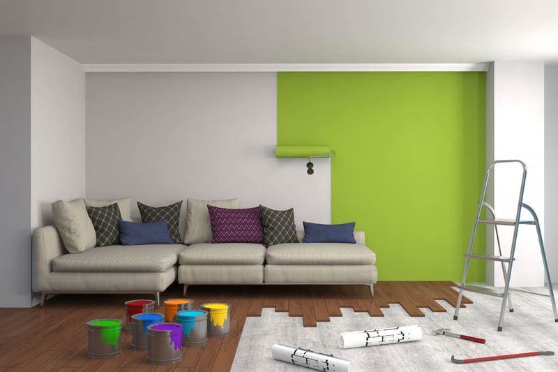
1. Neon Green
Neon green may seem like a bold, trendy choice, but it can make your space feel chaotic and less sophisticated. This intense color often overwhelms, clashing with furniture and decor.
Instead of adding vibrancy, it may detract from your home’s elegance, making it feel more like a nightclub than a serene retreat. Designers suggest opting for softer green hues.
Consider sage or olive for a more refined and harmonious look. These colors provide warmth and comfort, enhancing rather than competing with your furnishings and art.
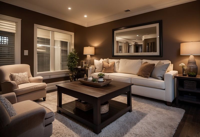
2. Dark Brown
Dark brown walls can make spaces feel cramped and outdated, reminiscent of the heavy, woody interiors of decades past. While they might evoke warmth, they often end up absorbing light.
This results in a room that feels smaller and more oppressive. To counteract this, designers recommend lighter, more neutral tones.
Think taupe or beige, which can create a sense of openness and airiness, allowing light to reflect and brighten the area. These shades are versatile, complementing a wide range of decor styles.
3. Bubblegum Pink
Bubblegum pink is often associated with youthful, playful spaces, but it can feel overly saccharine in adult living areas. This color tends to dominate, leaving little room for sophistication.
Incorporating such a bright pink into your decor can make it challenging to create a mature aesthetic. Opt for dusty rose or blush instead.
These softer pinks add a touch of elegance and warmth, without the overwhelming sweetness. They blend well with neutrals, offering flexibility in styling your space.
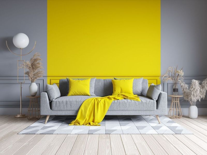
4. Bright Yellow
Bright yellow, while cheerful, can lead to overwhelming and visually chaotic spaces. Instead of opening up a room, it can clash with other elements, causing visual confusion.
This intense hue limits design choices, making it difficult to match with furniture and accessories. Designers often suggest softer yellows.
Pale butter or muted mustard tones can provide warmth and light without overpowering. These shades work well with natural materials, enhancing a room’s coziness and inviting feel.
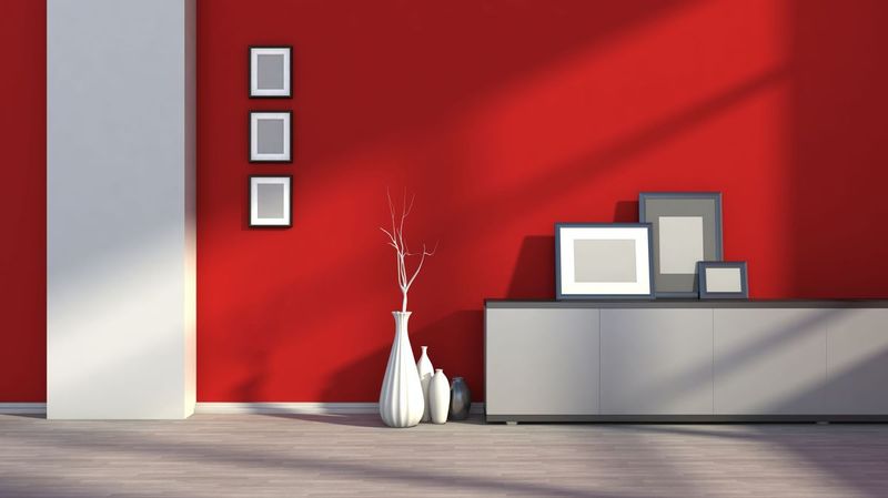
5. Crimson Red
Crimson red is a powerful color that can easily overwhelm a space, making it feel intense and closed-in. Often used in dining rooms, it can create an overstimulating environment.
This can detract from the room’s comfort and accessibility. Designers suggest opting for softer reds, like cherry or burgundy.
These shades maintain warmth and passion without the harshness of crimson, offering a sophisticated, welcoming ambiance. They pair beautifully with neutral and metallic accents.
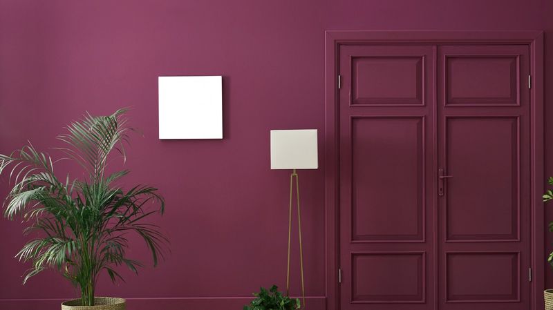
6. Eggplant Purple
Eggplant purple is often seen in gothic or dramatic interiors, but it can turn a space somber and unwelcoming. This deep hue absorbs light, shrinking the perceived space.
Instead of evoking luxury, it might cast a heavy, dated feel. Designers recommend lighter purples, such as lavender or lilac.
These shades introduce a touch of whimsy and elegance, brightening the space and making it more inviting. They work well with both modern and classic decor.
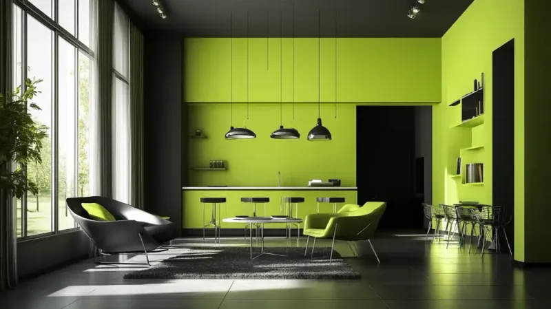
7. Lime Green
Lime green is a daring choice that can easily backfire, making a kitchen feel stark and unwelcoming. Its vibrancy can clash with the sleekness of appliances and countertops.
This can result in a jarring, rather than complementary, aesthetic. Designers recommend softer greens like mint or pistachio.
These hues lend freshness without overpowering, harmonizing well with both modern and rustic elements. They create an inviting, lively atmosphere that feels both contemporary and comfortable.
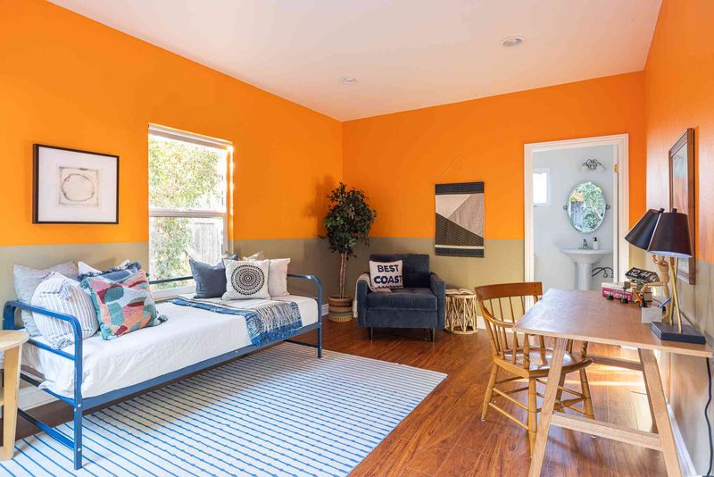
8. Orange
While orange can be warm and inviting, it often leads to a dated and overwhelming ambiance. Its intensity can clash with various decor styles, limiting design flexibility.
Rooms painted in orange can feel smaller and more chaotic. Designers suggest opting for terracotta or peach instead.
These softer shades offer a similar warmth without the intensity, creating a relaxed and timeless feel. They pair beautifully with natural textures and neutral tones.
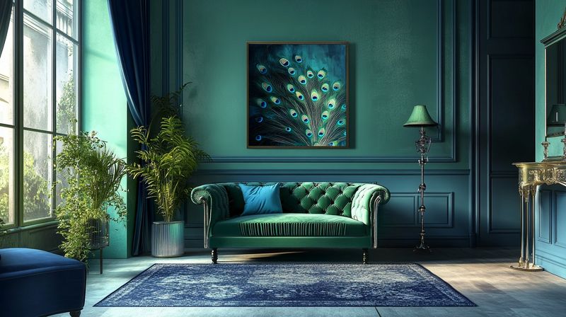
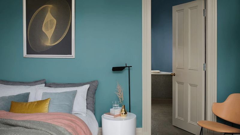
9. Peacock Blue
Peacock blue, though rich and luxurious, can become overbearing if not balanced carefully. Its boldness can overshadow delicate design elements, leading to a cluttered aesthetic.
While it can add opulence, it’s crucial to incorporate it sparingly. Designers recommend pairing it with softer tones like grey or beige.
This pairing ensures the boldness of peacock blue enhances rather than dominates the space, creating a sophisticated, balanced look.
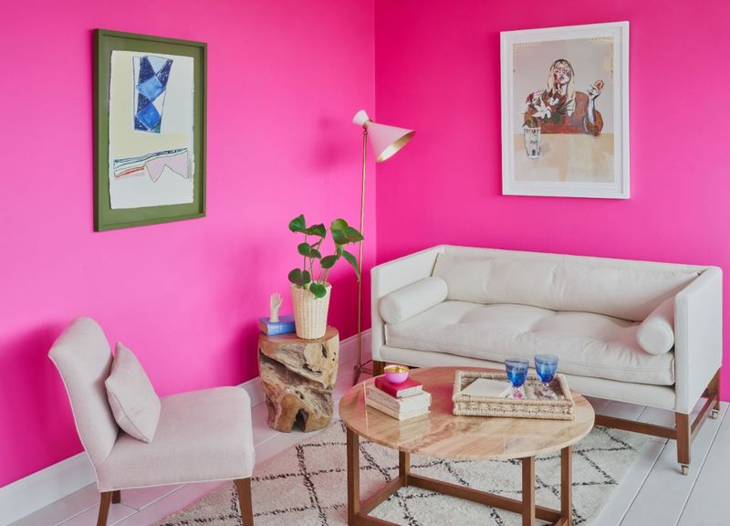
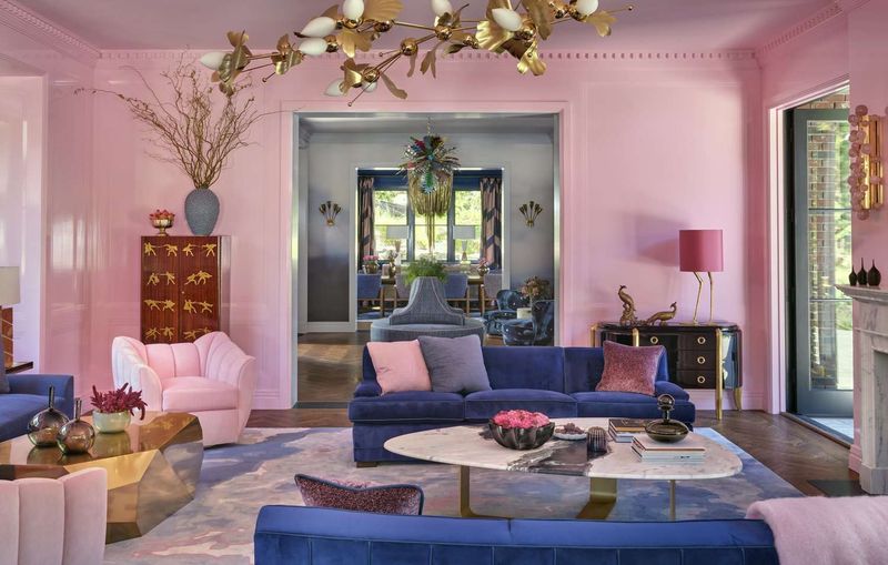
10. Hot Pink
Hot pink is striking but can easily overwhelm a space, making it challenging to achieve a cohesive design. Its vibrancy often dominates, limiting complementary decor choices.
For a more balanced approach, designers suggest using hot pink as an accent rather than a primary color. This prevents it from overshadowing the room’s design.
Pair it with neutral backgrounds and subtle textures to maintain a lively yet harmonious atmosphere. This way, hot pink adds flair without overwhelming the senses.
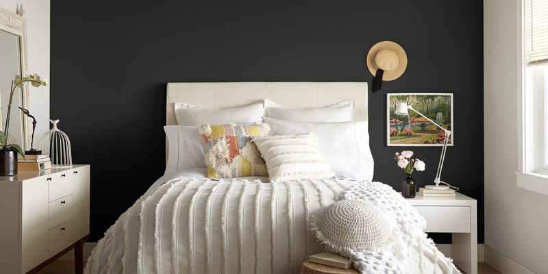
11. Black
Black is a classic and sophisticated choice, yet it can create a cold, uninviting atmosphere if overused. Its intensity can make spaces feel smaller and less welcoming.
Designers suggest using black strategically, perhaps as an accent color or within a monochromatic palette to maintain elegance without sacrificing warmth.
Balancing black with lighter tones such as whites or creams can soften its impact, creating a sophisticated, modern, and inviting environment.
12. Sky Blue
Sky blue is refreshing but can result in an overly themed look, particularly in spaces like bathrooms. Its lightness may border on kitschy if overdone.
Designers recommend using sky blue as a complementary color, enhancing its freshness without overwhelming the space’s design.
Pairing it with whites and natural textures can maintain the airy, beachy feel while avoiding the pitfalls of an overly themed room.
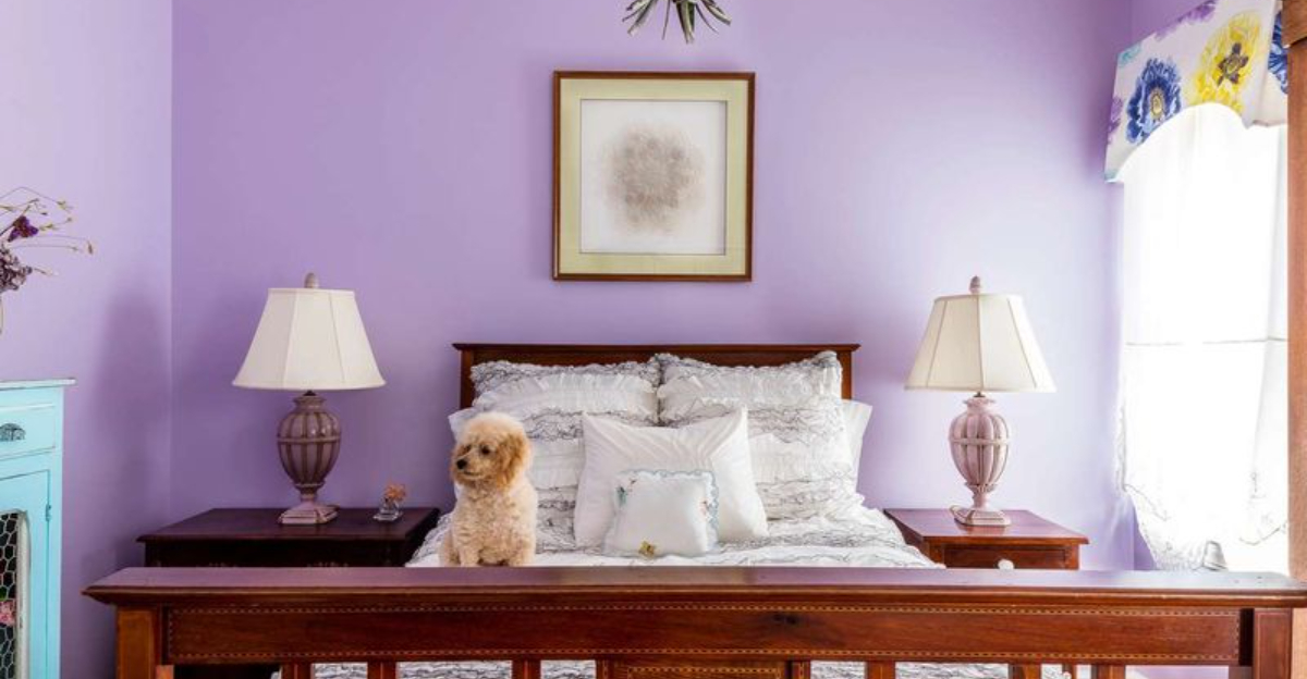
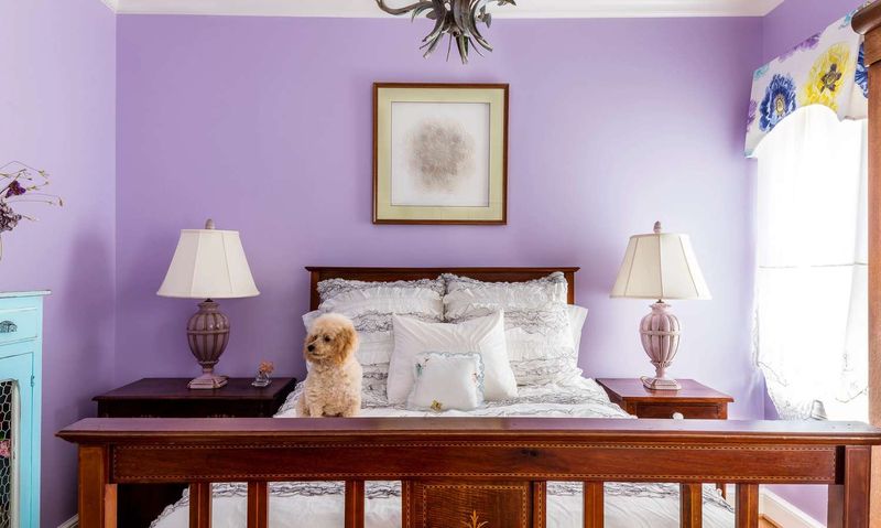
13. Pastel Purple
Pastel purple is charming but can make adult spaces feel too playful or juvenile. Its softness, while calming, might lack the sophistication desired in more mature settings.
Designers suggest incorporating this hue sparingly or as an accent to maintain its charm without compromising sophistication.
Pairing pastel purple with neutrals and natural materials can enhance its elegance, providing a balanced, serene atmosphere suitable for all ages.
